Plotting tutorial
Some user input is required to be given in terms of astropy quantities (astropy.unit.Quantity objects). As such, we begin by importing astropy units. Some matplotlib functions are also useful, but not nessecary.
[1]:
import astropy.units as u
import matplotlib.pyplot as plt
Loading a test data
The cosmoglobe plotting tools can be invoked on many different types of data sets. Some of the functions are generalized to take arrays, cosmoglobe sky model objects or strings of fits files.
[2]:
import cosmoglobe
chain = cosmoglobe.get_test_chain()
model = cosmoglobe.model_from_chain(chain, nside=256, )
model.remove_dipole(30 * u.deg) # Remove dipole on cmb component
dust = model.components["dust"].amp # Fetch the dust amplitude from the model object
Initializing model from cached chainfile
synch: 100%|█████████████████████████████████| 6/6 [00:05<00:00, 1.03it/s]
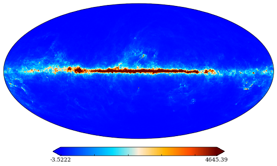
Plot sky maps
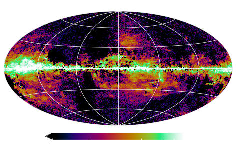
[3]:
cosmoglobe.plot(dust)
[3]:
(<matplotlib.collections.QuadMesh at 0x7f822f20d5e0>,
 {'data': array([30.30987493, -0.43109241,  8.45230192, ...,  6.66705892,
          9.97193761, 11.8158503 ]),
  'comp': None,
  'sig': 0,
  'rlabel': None,
  'llabel': None,
  'unit': None,
  'ticks': [-3.522202903472494, 4645.392197172208],
  'min': None,
  'max': None,
  'rng': None,
  'norm': None,
  'norm_dict': None,
  'cmap': 'planck',
  'freq_ref': None,
  'width': 8.302200083022,
  'nside': 256,
  'ticklabels': ['$-3.52$', '$4645$']})
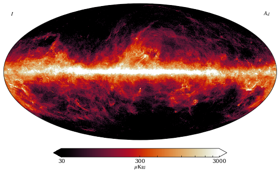
A handy feature with the cosmoglobe map plotter is that it auto-formats specific components. If the component is specified to be “dust”, it will apply a suitible range, colormap and label.
[4]:
cosmoglobe.plot(dust, comp="dust",)
[4]:
(<matplotlib.collections.QuadMesh at 0x7f822f285310>,
 {'data': array([30.30987493, -0.43109241,  8.45230192, ...,  6.66705892,
          9.97193761, 11.8158503 ]),
  'comp': 'dust',
  'sig': 0,
  'rlabel': '$A_d$',
  'llabel': '$I$',
  'unit': '$\\mu\\mathrm{K}_{\\mathrm{RJ}}$',
  'ticks': [30, 300, 3000],
  'min': None,
  'max': None,
  'rng': None,
  'norm': 'symlog2',
  'norm_dict': {'linthresh': 5},
  'cmap': 'sunburst',
  'freq_ref': 545.0,
  'width': 8.302200083022,
  'nside': 256,
  'ticklabels': ['$30$', '$300$', '$3000$']})
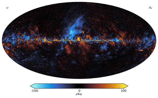
If the input data has polarization data in it, the stokes parameter can also be specified to the autoformatter
[5]:
import healpy as hp
cosmoglobe.plot(dust, comp="dust", sig="U",)
[5]:
(<matplotlib.collections.QuadMesh at 0x7f822f1fd490>,
 {'data': array([ 2.61048442,  2.11811903, -0.90430579, ..., -6.73241148,
          0.47604929,  0.76062461]),
  'comp': 'dust',
  'sig': 2,
  'rlabel': '$A_d$',
  'llabel': '$U$',
  'unit': '$\\mu\\mathrm{K}_{\\mathrm{RJ}}$',
  'ticks': [-100, 0, 100],
  'min': None,
  'max': None,
  'rng': None,
  'norm': 'symlog2',
  'norm_dict': {'linthresh': 5},
  'cmap': 'iceburn',
  'freq_ref': 353.0,
  'width': 8.302200083022,
  'nside': 256,
  'ticklabels': ['$-100$', '$0$', '$100$']})
From here, you can go crazy with the plotting options, and any specified values will overwrite the autoformatting.
[6]:
cosmoglobe.plot(dust, sig="Q", ticks=[0, 3.14, None], norm="symlog2", unit=u.uK, fwhm=14*u.arcmin, nside=512, cmap="chroma", llabel="Left", rlabel="Right", title="Cool figure", width=7, graticule=True, projection_type="hammer", graticule_color="white", xtick_label_color="white", ytick_label_color="white", darkmode=True)
plt.gca().set_facecolor('black')
ud_grading map
As already mentioned, the cosmoglobe plotter can take several different input types. Simply pass it the path to your fits file, and it will plot it.
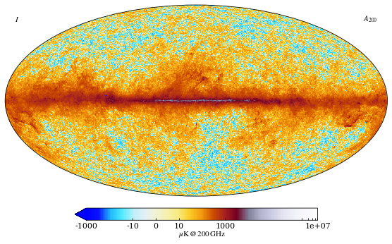
When using the cosmoglobe model object, there are even more features! For example, one can look at the sky at a specific frequency
[7]:
cosmoglobe.plot(model, freq=200*u.GHz)
[7]:
(<matplotlib.collections.QuadMesh at 0x7f8236530a00>,
 {'data': array([-34.40163726, -20.67277589,  -7.88908548, ...,  26.28084726,
          43.24612069,  35.33748385]),
  'comp': 'freqmap',
  'sig': 0,
  'rlabel': '$A_{200}$',
  'llabel': '$I$',
  'unit': '$\\mu\\mathrm{K}\\,@\\,200\\,\\mathrm{GHz}$',
  'ticks': [-1000.0, -10, 0, 10, 1000.0, 10000000.0],
  'min': None,
  'max': None,
  'rng': None,
  'norm': 'symlog2',
  'norm_dict': None,
  'cmap': 'planck_log',
  'freq_ref': <Quantity 200. GHz>,
  'width': 8.302200083022,
  'nside': 256,
  'ticklabels': ['$-1000$', '$-10$', '$0$', '$10$', '$1000$', '$10^{7}$']})
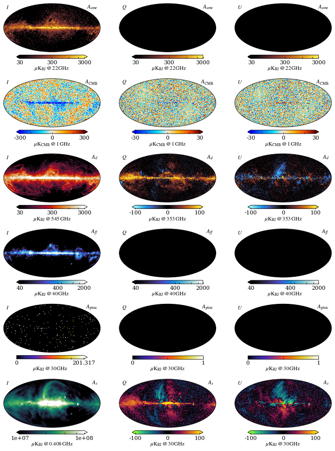
You can plot whatever component you like, and all of them have their own profile. Plot them all at the same time, even! I don’t care:
[8]:
signals = ["I", "Q", "U"]
include_components = model.components.keys()
num=1
for comp in include_components:
    for sig in signals:
        sub = (len(include_components), len(signals), num)
        cosmoglobe.plot(model, comp=comp, sig=sig, sub=sub, width=10)
        num+=1
plt.tight_layout()
All these functions can be invoked with the command line as well, using “click” functionality. This can be done by typing cosmoglobe plot map.fits
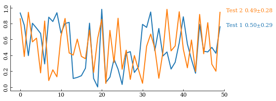
Traceplot
Cosmoglobe comes with more than just sky-map plotting features. It also allows the user to plot a quantity in a chain over Gibbs samples in a formatted way.
[9]:
#cosmoglobe.trace(chain, figsize=(10,2), sig=0, labels=["Reg1","Reg2","Reg3","Reg4"], dataset="synch/beta_pixreg_val", ylabel=r"$\beta_s^T$")
import numpy as np
data = np.random.rand(50, 2)
cosmoglobe.trace(data, labels=["Test 1","Test 2",], )
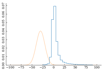
Histogram
Histograms of the same values are also useful and can be accessed through
[10]:
cosmoglobe.hist(dust[1].value, figsize=(6,4), range=(-100,100), bins=40, prior=(-30,10))
[10]:
(array([2.30421531e-06, 1.28011961e-06, 1.53614354e-06, 3.84035884e-06,
        6.14457415e-06, 6.14457415e-06, 9.72890907e-06, 1.53614354e-05,
        1.51054114e-05, 2.91867272e-05, 2.96987751e-05, 5.55571913e-05,
        7.78312726e-05, 1.21355339e-04, 1.92786014e-04, 3.28478693e-04,
        6.89472424e-04, 1.81828190e-03, 9.48747851e-03, 5.37353250e-02,
        6.92547272e-02, 2.77898607e-02, 1.19642539e-02, 6.13228500e-03,
        3.87927448e-03, 2.81933544e-03, 2.13523952e-03, 1.65980309e-03,
        1.32364368e-03, 1.09450227e-03, 9.75707170e-04, 8.61264477e-04,
        7.44773592e-04, 6.38011616e-04, 5.30993616e-04, 4.34472597e-04,
        3.69954569e-04, 3.09532923e-04, 2.42710679e-04, 2.12755880e-04]),
 array([-100.,  -95.,  -90.,  -85.,  -80.,  -75.,  -70.,  -65.,  -60.,
         -55.,  -50.,  -45.,  -40.,  -35.,  -30.,  -25.,  -20.,  -15.,
         -10.,   -5.,    0.,    5.,   10.,   15.,   20.,   25.,   30.,
          35.,   40.,   45.,   50.,   55.,   60.,   65.,   70.,   75.,
          80.,   85.,   90.,   95.,  100.]),
 [<matplotlib.patches.Polygon at 0x7f822f9d7640>])
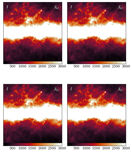
Gnomonic view
Cosmoglobe also provides gnomonic view plotting
[11]:
cosmoglobe.gnom(dust, comp="dust", norm="linear", sub=(2,2,1), fontsize={"title": 15,})
cosmoglobe.gnom(dust, comp="dust", norm="linear", sub=(2,2,2), fontsize={"title": 15,})
cosmoglobe.gnom(dust, comp="dust", norm="linear", sub=(2,2,3), fontsize={"title": 15,})
cosmoglobe.gnom(dust, comp="dust", norm="linear", sub=(2,2,4), fontsize={"title": 15,})

plt.tight_layout(pad=0.0,)
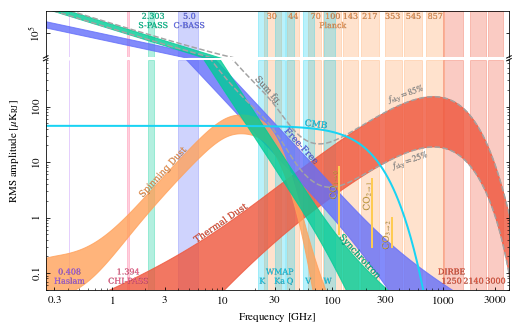
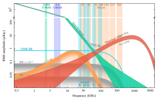
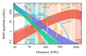
Frequency spectrum
Another key feature of cosmoglobe is its ability to plot the full frequency spectrum of a given model.
[12]:
# Full page frequency spectrum in intensity and polarization
cosmoglobe.spec(model,)
cosmoglobe.spec(model,pol=True)
# Smaller version
cosmoglobe.spec(model, fraction=0.5, extend=False, comp_labelsize=8, band_labelsize=7, )
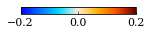
Standalone colorbar
When writing papers it is often useful to have standalone colorbars. Cosmoglobe has this feature, just provide it with a colormap, ticks and a unit.
[13]:
cosmoglobe.standalone_colorbar("planck", ticks=[-0.2,0,0.2], unit=r"$S/\sigma_S$", )